
Color drenching wraps your walls, trim, doors, ceiling, and built-ins in one hue, creating an immersive, sculptural room with amplified depth. Choose a shade that suits your mood and architecture, then test its undertones in changing daylight. Use matte for velvety drama, eggshell for durability, or satin accents for definition. Layer wood, velvet, ceramics, and metal to add dimension without breaking the spell. With thoughtful finishes and lighting, you can make the bold look feel effortless—then refine every detail ahead.
Understand How Color Drenching Works
Color drenching wraps a room in one dominant hue, extending it across walls, trim, doors, ceilings, and often built-ins. You create an uninterrupted visual field that softens edges, enlarges perceived depth, and gives architecture a sculptural presence. Instead of treating trim as a contrast line, you let it merge into the composition, making details feel intentional and immersive. Color psychology shapes the experience: a saturated envelope can energize your workspace, while a muted tonal wash can make a retreat feel cocooning and calm. Lighting considerations matter because daylight, warm lamps, and directional fixtures shift how the finish reads throughout the day. Test paint on multiple planes, then watch it under your actual lighting. You’re not simply painting surfaces—you’re redesigning how the room feels, functions, and commands attention.
Choose a Color for Your Room
Start with the mood you want to command: deep green can ground a dining room, inky blue can sharpen a study, and dusty rose can turn a bedroom into a soft retreat. Let your room’s purpose lead the decision, then test shades in changing daylight before committing. A saturated hue creates drama, while a softened mineral tone delivers quiet intensity without fading into the background.
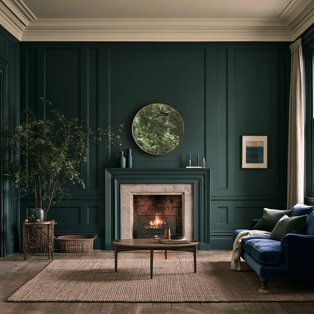
Consider the architecture, too. Low ceilings often benefit from enveloping midtones; expansive rooms can carry deeper, more cinematic color. Build wall balance by noting permanent elements—flooring, stone, cabinetry, and window views—then choose a shade that amplifies rather than fights them. Your color mood should feel intentional from every angle, not merely striking on a paint chip. Trust the shade that makes the space feel unmistakably yours.
Pick Paint Finishes for Color Drenching
Finish is what gives a color-drenched room its depth, movement, and mood. You’re not simply choosing sheen; you’re engineering how color performs across every surface. Let Lighting considerations guide your decision, since daylight and fixtures can amplify gloss or soften matte intensity.
- Choose matte for a velvety, immersive architectural effect.
- Use eggshell on walls needing subtle durability and gentle reflection.
- Select satin for trim when you want crisp, modern definition.
- Try high gloss on ceilings or doors for dramatic light play.
- Test Texture pairing before committing, ensuring finishes read intentionally together.
Keep the finish palette disciplined: one dominant sheen creates a seamless visual field, while a strategic secondary sheen adds precision without breaking the drench. Sample boards at different times of day, then choose the option that makes your color feel most dimensional and unapologetically complete.
Add Contrast With Texture and Decor
Texture and decor keep a color-drenched room from feeling flat, giving the same hue new life through touch, shadow, and shape. Layer contrast textures that amplify your chosen color without interrupting its immersive effect: think nubby bouclé against lacquered surfaces, ribbed glass beside smooth plaster, or raw wood paired with polished metal. You’ll create depth that shifts beautifully as daylight moves across the room.
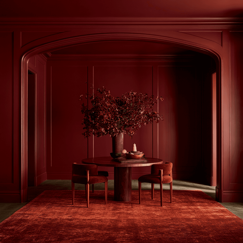
Choose decor accents with sculptural presence rather than visual noise. A tonal ceramic lamp, velvet cushion, woven rug, or faceted vase can introduce dimension while preserving the room’s bold, unified identity. Let each piece earn its place through material, silhouette, or finish. By mixing matte, gloss, grain, and softness, you transform one commanding color into a multidimensional experience that feels curated, tactile, and unmistakably forward-thinking.
Avoid Common Color Drenching Mistakes
Color drenching succeeds when you commit with intention, not when you coat every surface without a plan. You’re creating an immersive envelope, so test undertones, daylight shifts, and sheen before transforming the room. Let architecture guide your choices, then introduce bold accents strategically rather than competing colors everywhere.
- Don’t ignore trim, ceilings, or radiators; integrate them deliberately.
- Don’t mix clashing undertones across paint, flooring, and textiles.
- Don’t use high gloss indiscriminately; it magnifies flaws and glare.
- Don’t forget lighting; warm bulbs can radically alter saturated hues.
- Don’t overcrowd the space; edit decor to preserve visual impact.
You can balance with neutrals through natural wood, stone, linen, or a single pale textile. This restraint doesn’t dilute the drama—it sharpens it, giving your drenched color a confident, gallery-like presence.
Frequently Asked Questions
Can Color Drenching Work in Rental Apartments Without Permanent Changes?
Yes, you can make color drenching in rental apartments feel dramatic without risking your deposit. Use removable wallpaper, peel-and-stick tiles, tension-rod curtains, oversized textiles, and coordinated lighting to saturate walls, floors, and furnishings in one fearless hue. These temporary color drenching ideas let you build a cohesive, immersive environment, then remove everything cleanly when you leave. Choose rich tones and repeat them across every visible layer for maximum impact.
How Much Does Professional Color Drenching Typically Cost?
Professional color drenching typically costs $1,500 to $6,000 per room, depending on labor rates, room size, prep work, paint quality, and intricate trim. You’ll pay more for ceilings, cabinetry, or custom finishes, but strategic color palettes can maximize impact without expanding scope. For smarter budgeting tips, request itemized quotes, bundle multiple rooms, and choose durable midrange paint. You can create a cohesive, transformative result that feels radically intentional and future-forward.
Does Color Drenching Affect a Home’s Resale Value?
Color drenching can boost or limit your resale value, depending on execution and buyer taste. You’ll create powerful color impact when you use sophisticated, cohesive hues that highlight architectural details and feel intentional. Bold, highly personal palettes may narrow your buyer pool, though. Protect your upside by choosing premium finishes, maintaining flawless application, and offering easy repaint options. You’re not just decorating—you’re positioning your home as a memorable, design-forward property.
Can I Color Drench Exterior Spaces or Garden Rooms?
Yes—you can color drench exterior spaces and garden rooms, turning them into vivid extensions of your home. Like a flag planted in your landscape, a unified color palette creates instant identity and drama. Choose weather-resistant finishes, then let tool selection support crisp edges and durable coverage. You’ll transform pergolas, sheds, fences, and seating areas into immersive retreats. Balance bold hues with surrounding plants, sunlight, and architectural materials for a cohesive, innovative result.
Which Paint Brands Offer the Best Color-Drenching Palettes?
You’ll find standout color-drenching options from Farrow & Ball, Benjamin Moore, Sherwin-Williams, Little Greene, and Backdrop. Farrow & Ball delivers nuanced, atmospheric shades; Benjamin Moore offers expansive bold palettes; Sherwin-Williams brings durable innovation and accessible depth. Use color psychology to choose hues that energize, cocoon, or sharpen your space. Sample generously, then commit: matching walls, trim, ceilings, and doors creates a seamless, transformative statement that feels deliberately immersive.
Conclusion
Color drenching lets you turn a room into a fully realized mood, wrapping walls, trim, doors, and ceilings in one confident hue. Choose a color that energizes or grounds you, vary finishes for depth, and layer in texture to keep the look alive. Don’t dilute your vision with timid accents or mismatched undertones. When you commit, your space becomes a jewel box—rich, immersive, and impossible to ignore. Trust your instincts, test samples, and let color transform every corner.