

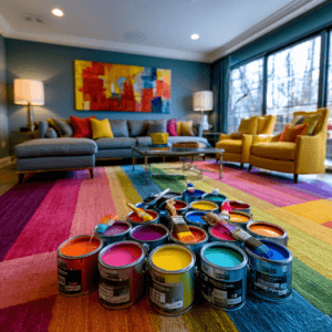
To avoid color shock, you need to test paint as a changing surface rather than a fixed chip. Place large sample boards beside your floors, cabinetry, rugs, and trim, then view them in morning light, afternoon shadows, and your actual evening bulbs. Notice whether undertones turn warmer, cooler, gray, or muddy. Avoid judging wet paint or crowded swatches. Choose the paint color that stays beautiful across real conditions, and you’ll see exactly how to get there.
Learn Why Paint Colors Shift in Your Home
Why does the same paint chip look creamy in the store, gray on your wall, and almost yellow by evening? Your eye doesn’t read paint in isolation; it reads relationships. Flooring, cabinetry, countertops, textiles, and trim all push color warmer, cooler, lighter, or muddier through contrast psychology. A soft white beside espresso wood feels brighter; beside blue stone, it can turn icy. Lighting psychology adds another layer: every bulb carries a color temperature that edits pigment in real time. Warm LEDs can pull gold from beige, while cool bulbs sharpen greens and grays. Even sheen changes perception, bouncing light across texture. To avoid color shock, treat paint as responsive technology rather than a fixed surface. You’re choosing how paint color behaves inside your entire visual system.
Check Natural Light Before Choosing Paint Colors
You’ll read a color more accurately when you watch it in morning light, where it may look crisp, cool, or unexpectedly pale. Compare that same wall in the afternoon, when warmer rays can deepen undertones and shift the mood. Test paint swatches in each room to see the true color before you commit.
Observe Morning Light
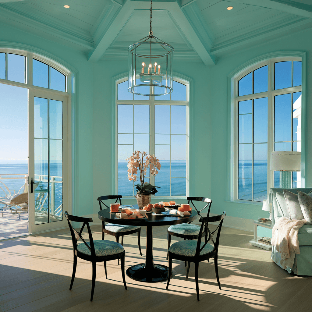
How does your room behave before the day fully wakes up? Before you commit to a color, watch how morning light enters, spreads, and fades across your walls. Early illumination often feels cooler, cleaner, and more revealing; it can sharpen pale hues or mute deeper tones. Notice where soft shadows gather around trim, corners, and furniture.
- You’ll feel whether a white reads crisp, sterile, or quietly luminous.
- You’ll see if beige turns elegant, flat, or unexpectedly yellow.
- You’ll sense whether blue feels serene, icy, or emotionally distant.
- You’ll catch greens shifting from botanical freshness to gray restraint.
Paint a sample board, move it through the room, and study it during your first routine. Your wall should support how you begin the day.
Compare Afternoon Shifts
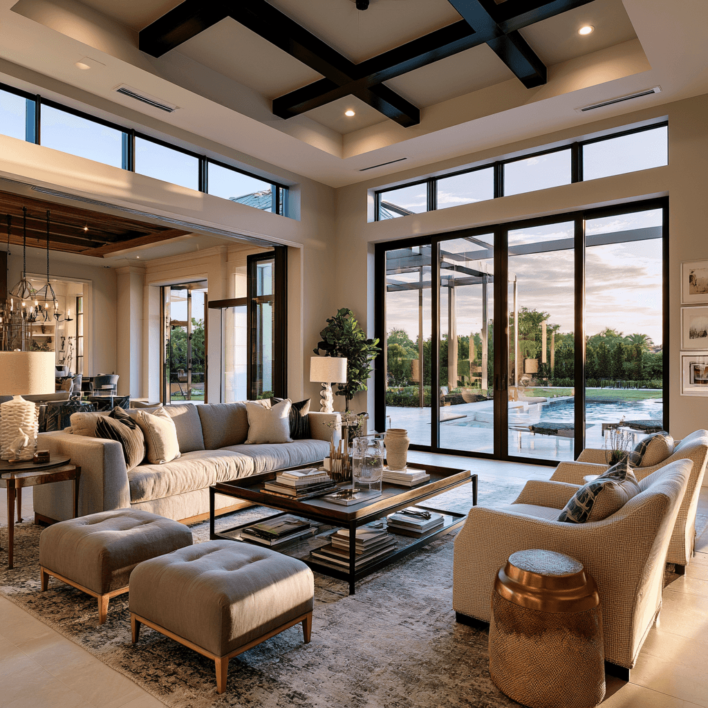
By afternoon, your room may tell a very different color story. As the sun moves, shadows stretch, surfaces brighten, and undertones either soften or sharpen. You’ll see afternoon shifts most clearly on large walls, near windows, and across open-plan sightlines where light travels farther.
Track how the warmth of lighting changes the mood. Western exposure can turn pale neutrals creamy, make blues feel greener, or push grays toward taupe. South-facing rooms may gain a polished glow, while north-facing spaces can stay cooler but less flat than they seemed at dawn. Don’t rely on memory; compare what you see now with your morning notes. You’re not choosing a color in isolation. You’re designing a responsive surface that should look intentional as daylight evolves through the home.
Test Paint Swatches
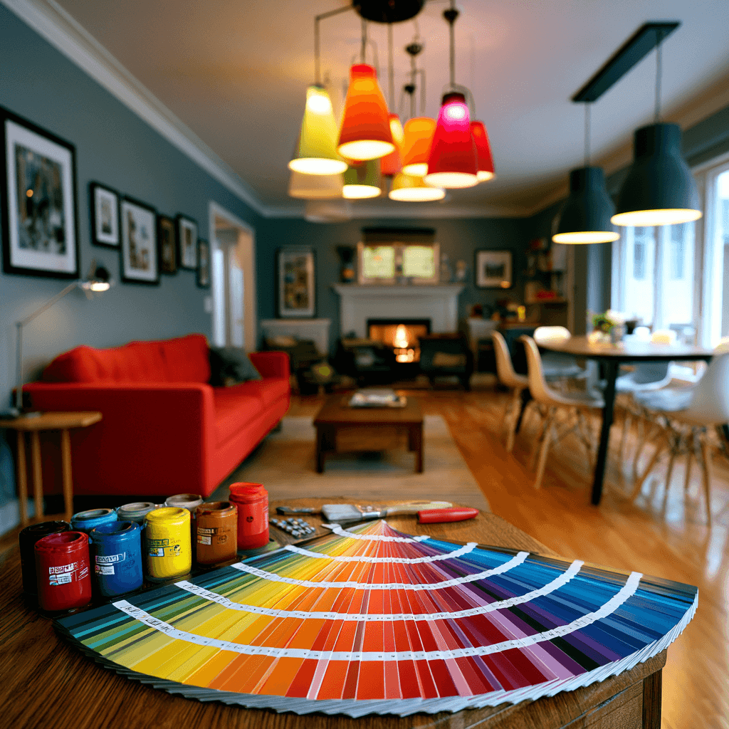
Swatches give changing light something concrete to reveal. You can’t trust a chip under store LEDs; paint broad samples on movable boards, then position them where mornings glow, afternoons sharpen, and evenings soften. These test swatch techniques help you see undertones before they catch you off guard.
- Watch how one white feels crisp at sunrise, then turns sterile by dusk.
- Move samples beside flooring, art, and upholstery to catch quiet clashes.
- Use the sample card comparison for fast contrast, but confirm with real paint.
- Sit with each color at night; your room should feel intentional, not improvised.
Choose the shade that stays composed through every shift. That’s where innovation meets comfort: responsive color, chosen with evidence.
Choose Colors Based on Room Direction
You’ll get very different paint results depending on whether a room faces north or south. North-facing rooms often need warmth to balance cool, shadowed light, while south-facing rooms can handle softer or cooler shades under steady brightness. Use the room’s direction as your first filter before you fall for a color on the chip.
North-Facing Room Colors
Why do north-facing rooms so often make paint feel cooler than expected? Because north-facing lighting stays indirect, shadowed, and bluish, it can drain warmth from cool-toned swatches and make crisp colors feel severe. You’ll get better results by choosing nuanced warmth: complex whites, muted clay, greige, mushroom, ochre, or soft rose-beige.
- Notice the mood: if the room feels quiet, don’t fight it; refine it with layered, velvety undertones.
- Test larger samples: paint boards and move them near corners, trim, and furniture.
- Balance with texture: use oak, brass, linen, boucle, or stone to add visual heat.
- Choose depth carefully: a mid-tone can feel cocooning, while pale colors may turn icy.
You’re designing atmosphere, not just selecting pigment.
South-Facing Room Colors
After the cool restraint of a north-facing room, a south-facing space brings the opposite challenge: abundant, warm, direct light that can intensify color fast. You’ll want to temper sunlit warmth with hues that stay composed under glare. Try chalky whites, mineral grays, muted sage, clay-beige, or softened blue; they’ll look luminous without turning loud. If you crave bolder color, choose a desaturated version and test it on several walls, because noon light and evening shade contrast can shift the mood dramatically. Avoid overly yellow creams, hot corals, and glossy finishes unless you want amplified heat. For a more advanced look, pair matte walls with reflective accents, letting architecture, not paint overload, carry the brightness. Your goal isn’t to mute the room; it’s to refine its energy.
Choose Paint Colors for Your Light Bulbs
Before you commit to a paint color, look at the bulbs that will illuminate it every evening. Your wall doesn’t live in daylight alone; it transforms under each color temperature and bulb type. Test swatches at night, with the exact fixtures you’ll use, and watch undertones sharpen, soften, or glow.
- Choose warm LEDs when you want creamy whites, clay tones, and muted greens to feel intimate.
- Use cool bulbs if you crave crisp grays, clean blues, or gallery-like precision.
- Try smart bulbs so you can tune the room’s mood before repainting.
- Avoid judging paint under bare utility bulbs; they can make elegant color feel harsh.
When light and pigment align, your space feels intentional, modern, and quietly magnetic.
Compare Paint With Floors and Furniture
Once your lighting flatters the paint, place each contender beside the surfaces that already command the room: floors, rugs, sofas, cabinetry, and wood furniture. You’re not matching; you’re engineering color harmony. Hold large swatches against oak grain, polished concrete, wool texture, leather, lacquer, and metal hardware. Notice undertones: a gray wall can turn blue beside warm maple, while cream may look yellow against black tile. Check material compatibility, too. Matte paint can soften glossy stone; a satin finish can echo sleek cabinetry without competing. If your furniture has bold geometry or saturated upholstery, let the wall act as a refined backdrop. If your flooring feels quiet, choose a shade with more depth. Build a palette that connects every surface, so the room feels intentional, current, and visually calm.
Test Paint Colors in Morning and Evening Light
How does your chosen shade behave when the day changes its angle? Track it at sunrise and again near dusk, when light cools, warms, sharpens, or softens its character. You’ll see shade temperature shift across walls like a quiet animation, revealing undertones you’d miss at noon. Smart swatch timing helps you choose with confidence, not regret.
- In morning light, notice whether the color feels crisp, airy, and energizing.
- By evening, watch for richness, shadow, and intimacy as the room settles.
- Compare both moments to your floors and furniture, so the palette feels intentional.
- Trust the shade that supports the mood you want to live with daily.
Your best color should perform beautifully across the day, not just once.
Avoid Common Paint Color Testing Mistakes
Why do some swatches lie the moment they hit the wall? You’re likely testing them too small, too close, or against distracting colors. Instead, paint large sample boards and move them through the room like portable data points. You’ll see how daylight, LEDs, shadows, flooring, and furnishings shift color accuracy hour by hour.
Don’t crowd six samples on one wall; they’ll contaminate each other visually. Leave white space between boards, label each finish, and photograph them under consistent settings. Smart paint swatch organization helps you compare tones without guessing later. Avoid testing over bold existing paint unless you prime first. Also, don’t decide while the paint’s wet; sheen and depth settle as it cures. Let your samples speak in real conditions before you commit.
Frequently Asked Questions
Can Paint Color Affect a Room’s Perceived Size?
Yes, paint color can reshape how large a room feels. You’ll expand space with pale, cool tones that reflect light and blur edges, while deep hues can pull walls inward for intimacy. Your color perception shifts with contrast, finish, and surrounding furnishings. Consider the lighting impact too: daylight opens colors, while warm bulbs soften them. Use strategic accent walls to stretch sightlines, define zones, and create smarter spatial flow.
How Do Paint Finishes Influence Color Appearance?
Paint finishes shift color by changing how light bounces. Roughly 80% of perceived color comes from lighting and reflection, so your sheen level matters. You’ll see matte finishes soften hues and hide flaws, while satin or gloss sharpens edges, deepens shadows, and can make colors feel brighter. Pair finish with color temperature: cool LEDs can crisp up blues; warm bulbs enrich creams. Test samples vertically before you commit.
Should Exterior Surroundings Influence Interior Paint Choices?
Yes, exterior surroundings should guide your interior paint choices. You’re not decorating in isolation; trees, brick, water, pavement, and exterior lighting all filter through windows and shift perception. Notice the color temperature outside: cool northern shade can flatten grays, while warm reflected sunlight can amplify creams or clay tones. You’ll get better results when you sample paint where daylight enters, then balance innovation with colors that harmonize with the view.
Can Primer Change the Final Paint Color?
Yes—primer can act like a quiet lens beneath your paint. You’ll see the final shade shift if the primer color contrasts strongly with your topcoat, especially under changing lighting temperature. Use white primer for crisp brights, gray for deeper saturated hues, and tinted primer when you want precision. You’ll reduce extra coats, control undertones, and create a smarter, more predictable finish that feels designed, not accidental in your home.
How Often Should I Repaint to Maintain Color Accuracy?
You should repaint every 5–7 years indoors, sooner in sunlit rooms, kitchens, baths, or high-touch spaces. To preserve color consistency, inspect walls yearly under natural and artificial light. If tones look dull, patchy, or shifted, refresh strategically. Use two word ideas like “light mapping” and “finish tracking” to guide decisions. You’ll maintain a crisp, intentional palette while letting your home adapt beautifully to changing technology, materials, and lifestyles.
Conclusion
Choosing paint isn’t just about the swatch—it’s about the light that touches it. Since color perception can shift by up to 30% under different lighting, you’ll save yourself from “color shock” by testing carefully. Watch your walls in morning sun, evening shade, and under your bulbs. Compare paint beside your floors, fabrics, and finishes. When you let your home’s actual light guide you, you’ll choose colors that feel intentional, balanced, and beautifully lived-in.