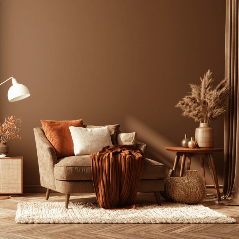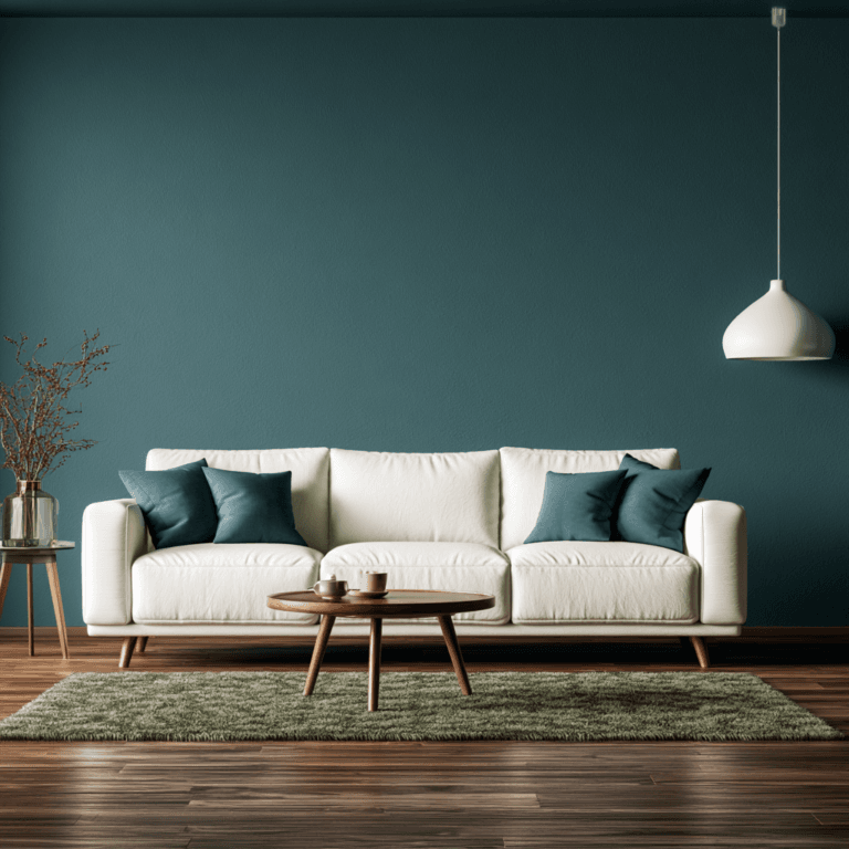

Yes, you can paint trim and ceilings the same color as your walls for a seamless, modern look that minimizes visual breaks and makes compact rooms feel larger. Keep the color consistent, but vary sheen: use matte on ceilings, eggshell on walls, and satin or semi-gloss on trim. Choose white trim when you want sharper architectural contrast, extra brightness, or easier future updates. Test large samples in daylight and evening light to see which approach best suits your space.
When Should Trim and Ceilings Match Walls?
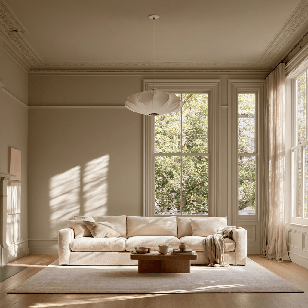
Trim and ceilings should match your walls when you want a cohesive, modern look that minimizes visual breaks. You’ll get the strongest result in contemporary homes, open-plan layouts, and rooms with streamlined millwork. This approach works especially well when your trim is simple, recessed, or intentionally architectural rather than ornate.
Make this trim color decision when you want finishes to feel integrated, not outlined. Use one durable paint formula with the appropriate sheen: typically matte or flat overhead, eggshell or satin on walls, and satin or semi-gloss on trim. You can keep the color consistent while adjusting sheen for performance and subtle definition.
Consider this strategy for built-ins, doors, and window casings that you want to blend into the envelope. Before committing, test samples under daylight and evening lighting to confirm the ceiling walls match cleanly.
How Matching Paint Changes Room Size and Mood
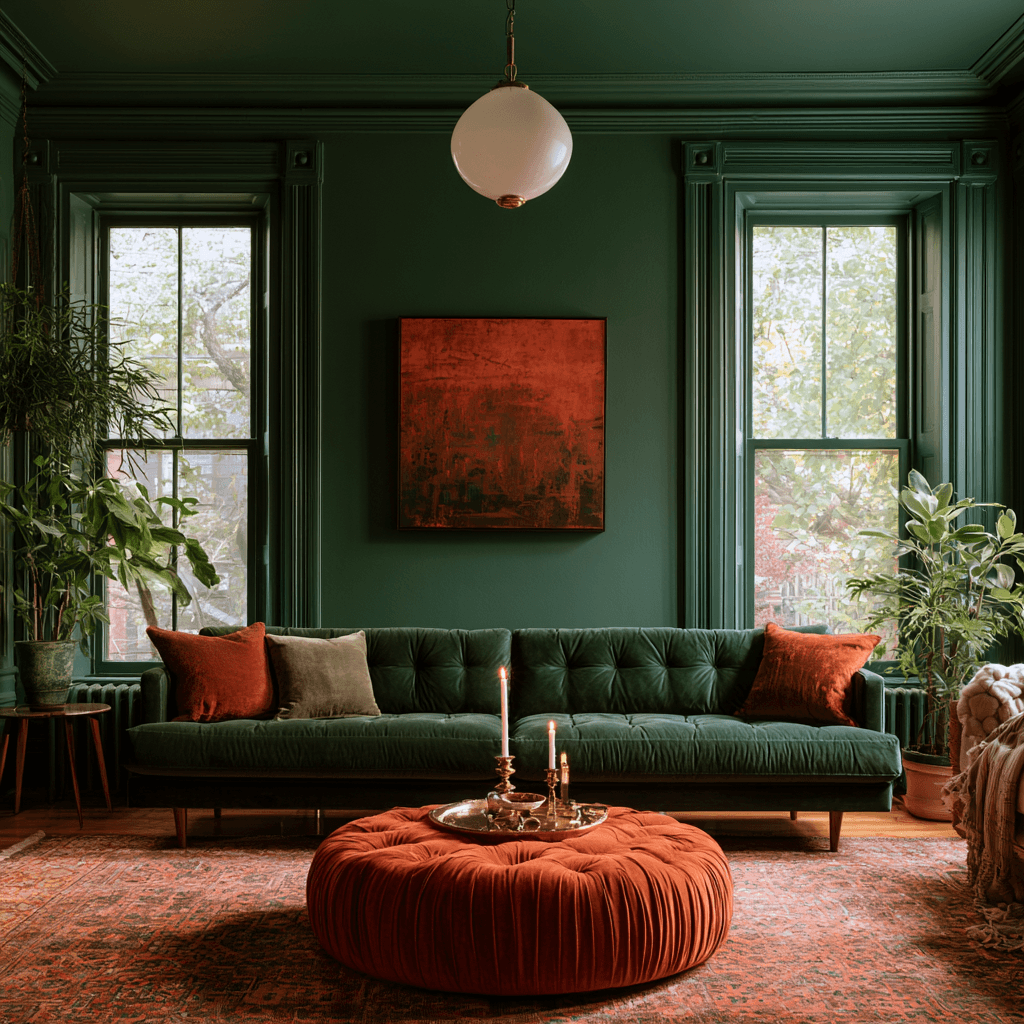
Matching your trim and ceiling to the wall color changes how you read a room’s boundaries. By reducing visual breaks, you create a continuous envelope that can feel immersive, tailored, and intentionally modern. This approach leverages contrast psychology: fewer hard edges let your eye travel freely, shifting perceived room scale effects without altering the footprint.
- In compact spaces, a single hue can soften corners and make the layout feel less segmented.
- In tall rooms, carrying color onto the ceiling can create a cocooning, grounded atmosphere.
- In expansive spaces, deeper matching tones can add drama and make furnishings feel more curated.
You’ll get the strongest result when you consider undertones, daylight, and sheen. A matte ceiling with satin trim adds subtle dimensionality while preserving the seamless, architectural effect. It also supports bold color choices confidently.
When White Trim Works Better Than Matching
White trim works better when you want to sharpen architectural details, brighten a room, or create a clear shift between wall colors. It gives doors, windows, crown molding, and baseboards a crisp visual edge, especially in homes with strong natural light or modern color blocking.
Choose white if your walls are deep, muted, or highly saturated and you want the palette to feel edited rather than enveloping. You’ll also gain flexibility: white trim can support future wall-color updates without requiring a full repaint of every surface. Consider trim dynamics when balancing bold cabinetry, patterned tile, or sculptural furnishings; the contrast keeps the room from feeling visually dense. For ceiling unity, use a coordinated white overhead when you want to lift the eye and preserve an airy, contemporary finish.
Best Paint Finishes for Walls, Trim, and Ceilings
Once you’ve chosen between contrast and a color-matched look, paint sheen determines how refined—and how practical—the result feels. Even with one hue, different paint finishes create subtle definition, durability, and visual depth. Consider the matching implications: high contrast in sheen can make trim stand out, while closely aligned finishes deliver a more seamless, contemporary effect.
- Choose matte or flat for ceilings to minimize glare and disguise minor surface imperfections.
- Use eggshell or low-luster on walls for a soft, washable finish that suits active living spaces.
- Apply satin or semi-gloss to trim for resilient, wipeable protection and crisp architectural detail.
For a design-forward monochromatic scheme, pair matte walls with satin trim rather than high-gloss. You’ll get tactile dimension without interrupting the room’s streamlined color story. Test samples under daylight and evening lighting before committing.
Choose Matching Colors for Light and Architecture
Natural and artificial light can shift how a shared wall, trim, and ceiling color reads throughout the day, so assess samples in the room before you commit. Test large swatches near windows, doorways, and recessed areas, then view them under daytime, evening, and layered LED lighting. Matching colors can create a seamless, contemporary envelope that makes compact rooms feel calmer and more expansive. Choose an undertone that supports your flooring, cabinetry, and fixed finishes; even subtle shifts can look disjointed across planes.

Let the room’s form guide your decision. A single color softens busy moldings and awkward transitions, while deliberate architecture contrasts can spotlight beams, arches, paneling, or ceiling height. In low-light spaces, use a light-reflective hue to preserve openness. For bold, design-forward rooms, a saturated all-over shade creates immersive depth without fragmenting the architecture.
Frequently Asked Questions
Can Matching Paint Hide Imperfections in Old Trim?
Yes, matching paint can visually soften minor dents, uneven edges, and patched areas in old trim by reducing contrast between surfaces. You’ll still want to fill cracks, sand raised grain, and prime stains first, since color won’t conceal deep damage. For historic preservation, choose reversible repairs and eco friendly finishes with low VOCs. A matte or eggshell sheen offers a current, cohesive look while minimizing flaws better than glossy paint.
Should Doors Match the Walls, Trim, or Ceiling?
About 60% of designers favor doors that match trim for a polished, architectural look. You’ll create clear door color coordination by pairing doors with trim when you want continuity and crisp trim vs wall contrast. Match doors to walls for a seamless, contemporary effect that visually expands smaller rooms. Don’t match ceilings unless you’re intentionally creating a color-drenched space. Test samples in changing light before committing to a finish.
How Often Should Matching Trim and Ceiling Paint Be Repainted?
You should repaint matching trim and ceiling paint every five to seven years, depending on traffic, humidity, sunlight, and cleaning habits. High-touch trim may need attention sooner, while ceilings often last longer. For longevity, choose durable, washable finishes and address stains or chips promptly. In two word discussion ideas, prioritize maintenance planning and finish performance. Trend-aware color continuity looks freshest when you refresh surfaces together, ensuring consistent sheen, coverage, and a polished result.
Does Matching Paint Affect Home Resale Value?
Matching paint can boost perceived resale appeal like a million-dollar frame around your rooms, but it won’t guarantee a higher sale price. You’ll improve matching value when you choose versatile, buyer-friendly neutrals and maintain crisp finishes. Trend-aware buyers often appreciate cohesive, modern interiors, especially in smaller spaces. However, bold monochromatic schemes can narrow appeal. Consider repaint frequency too: durable, washable paint protects your investment and keeps the home market-ready.
Can Renters Use Matching Colors Without Losing Their Security Deposit?
Yes, you can use matching colors in a rental without losing your security deposit if you follow rental color policies and secure written approval first. Choose neutral, easily reversible shades and use high-quality products for better paint durability. Document wall conditions with photos before and after painting. Keep leftover paint for touch-ups, and agree on restoration expectations. A cohesive, color-drenched look can feel current while remaining landlord-friendly and move-out ready.
Conclusion
Matching your trim and ceiling to your walls can create a seamless, modern look that makes small rooms feel larger and architectural details feel intentional. Think of it as wrapping the room in one tailored suit. Choose this approach when you want warmth, drama, or a calm, cocooning effect. Keep white trim when you need contrast, brighter definition, or to highlight traditional features. Whatever you choose, use the right sheen and test samples in your room’s changing light first.