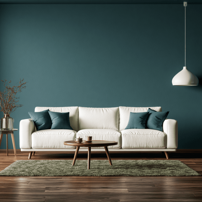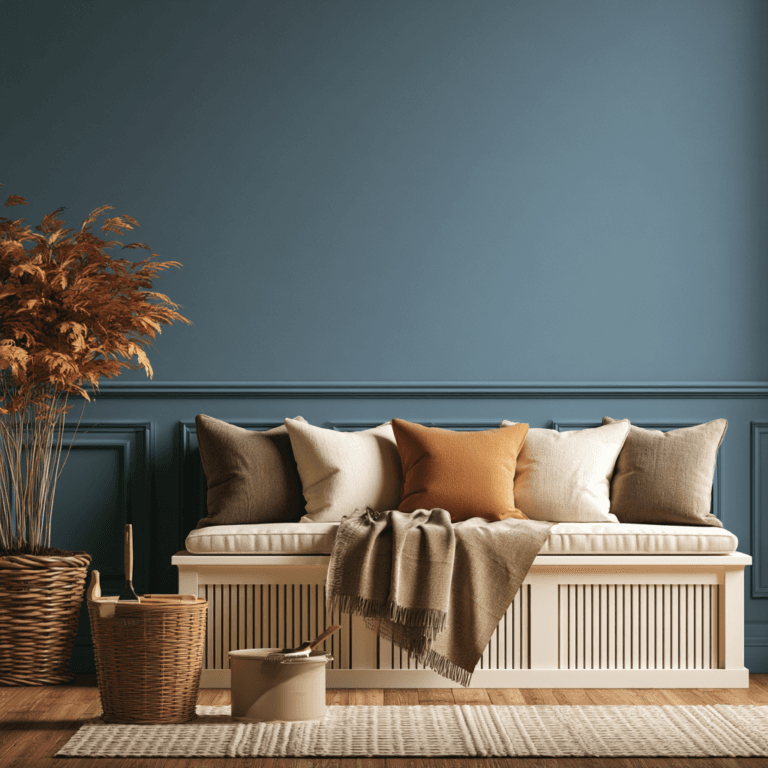

In Southwest Florida, warm khaki can soften intense coastal light and create a grounded, polished backdrop. Sherwin-Williams Universal Khaki pairs beautifully with crisp white trim, oak, linen, stone, and woven textures. Add terracotta sparingly through a feature wall, tile, art, or accessories for sun-baked depth without visual weight. Choose matte finishes to reduce glare, and test colors in your home’s daylight and evening lighting. Ahead, you’ll find room-by-room ways to build the palette.
Why Earth Tones Work in SWFL Homes
In Southwest Florida, earth tones feel at home because their warm, brown-based pigments soften abundant sunlight rather than fighting it. You get rooms that feel grounded, layered, and effortlessly composed instead of stark beneath the coastal glare. Warm earth tones bring an organic sophistication to open plans, pairing beautifully with stone, oak, linen, and contemporary metal finishes.
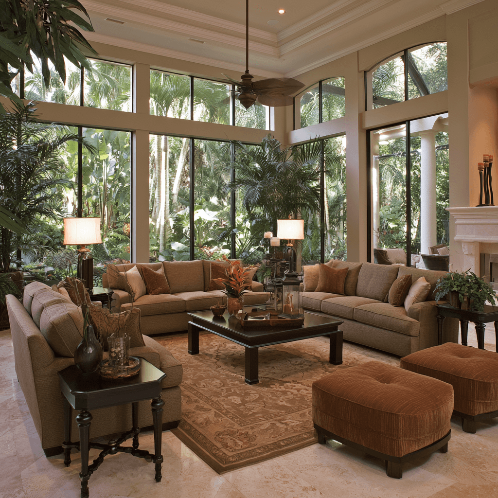
Universal Khaki offers a particularly forward-looking neutral: its soft yellow undertone holds its character in bright conditions while supporting both whole-home continuity and focused design moments. In lower-sun spaces, terracotta, rust, ochre, and muted gold introduce comfort without demanding saturated color. Their softened chroma also accommodates the everyday variation of sand, greenery, and changing skies. Test samples in your actual natural light, especially on north-facing walls, and use 2700K–3000K lighting so warm pigments retain their nuanced, inviting depth.
Choose a Warm Khaki Wall Color
Choose SW 6150 Universal Khaki when you want a warm, enduring wall color that holds its own in Southwest Florida’s bright, shifting light. This mid-tone neutral carries soft yellow undertones, giving your interior paint scheme livability, longevity, and a quietly tailored finish. Paint all four walls for an immersive, cohesive envelope, then add crisp white trim to define the architecture and keep the color from feeling flat.
Before committing, test samples in north- and south-facing rooms. You’ll want the warm khaki to reveal brown and amber warmth rather than blue, violet, or green-gray casts. Its adaptable depth supports a natural, design-forward foundation: layer woven baskets, oak furnishings, and soft linen for tactile dimension. For a more nuanced effect, introduce broader accents such as Garden Gate or Limestone, allowing the walls to remain grounded, refined, and responsive.
Pair Universal Khaki With Coastal Neutrals
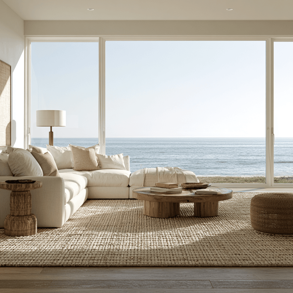
Pair Universal Khaki with crisp coastal whites and creamy neutrals to create a layered, light-filled foundation. You’ll balance its soft warmth with Watery blues or deeper tones like Limestone, giving Florida-bright rooms polished contrast. Finish with white millwork, oak, linen, jute, and rattan for texture that feels relaxed yet refined.
Layering Coastal Neutrals
Universal Khaki (SW 6150) creates a sun-warmed foundation for SWFL interiors when you layer it with crisp White Snow and soft, welcoming neutrals such as Cream and Sugar or Lemon Chiffon. You’ll keep rooms airy while giving them the grounded warmth that coastal neutrals need in Florida’s vivid daylight. Add tactile materials to make these warm tones feel refined, not flat.
- Paint all four walls in Universal Khaki for a cohesive, immersive backdrop.
- Define the architecture with White Snow trim, then introduce oak furniture, woven baskets, and relaxed linen upholstery.
- Use Garden Gate or Limestone in small furnishings, cabinetry details, or an accent niche to create nuanced depth.
Test each palette in your home before committing. Sun exposure can shift earthy undertones dramatically, while 2700K–3000K bulbs preserve the inviting, softly layered finish you’re after.
Balancing Warm And Cool
Because SWFL light can amplify undertones, use Universal Khaki as your warm, sun-softened wall color and let coastal neutrals provide a quieter counterpoint. Its soft yellow cast stays grounded beside crisp White Snow, while Cream and Sugar or Lemon Chiffon extends the palette with an easy, livable flow.
Build contrast strategically, not competitively. Introduce Garden Gate or Limestone through cabinetry, upholstery, or architectural details; their cooler read gives these earthy tones dimension without chilling the room. For a more progressive coastal note, reserve Tarragon, Watery, or a muted dusty blue for art, cushions, and drapery. You’ll create visual freshness while keeping warmth in command. Test each pairing in north- and south-facing spaces, where greige and ochre can shift dramatically. Let one temperature lead, then use the other as a finely calibrated accent.
Adding Natural Texture
Let texture do the quiet work: Universal Khaki walls gain an effortless coastal polish when you frame them with crisp White Snow trim and layer in Cream and Sugar or Lemon Chiffon through upholstery, rugs, and window treatments. You’ll keep the room sunlit yet grounded, a refined approach to paint colors thats popular in SWFL.
- Add woven baskets, rattan, and jute for tactile contrast that makes khaki feel lived-in, not paint-only.
- Anchor the scheme with oak furniture, Natural wood beams, or warm stone; layer Garden Gate or Limestone for tailored depth in bright Florida light.
- Introduce Tarragon or Watery in restrained accents—a ceramic vase, throw, or art detail—to echo Universal Khaki’s soft yellow undertone without disrupting its earthy calm.
Paint all four walls for continuity, then let your materials create the innovation.
Build a 2026 Earth-Tone Color Palette
Begin with Universal Khaki’s soft yellow warmth, then sharpen the room with White Snow and grounded neutrals such as Limestone or Garden Gate. You can layer Cavern Clay or Baked Clay for a sun-baked terracotta accent, reserving deeper Rookwood Terra Cotta for a dramatic feature wall. Finish with Accessible Beige or Shiitake to keep the palette inviting, and test every sample in your home’s changing light.
Start With Warm Khaki
For a 2026 earth-tone palette that feels polished yet lived-in, ground the room in Sherwin-Williams Universal Khaki (SW 6150), a warm mid-tone neutral with a soft yellow undertone. You can use it across all four neutral walls for a cohesive, sun-washed foundation that feels tailored rather than flat.
- Frame Universal Khaki with crisp white trim, such as White Snow, to sharpen architectural lines and amplify SWFL light.
- Add Garden Gate or Limestone through cabinetry, built-ins, or upholstery for a deeper, grounded contrast.
- Introduce oak, woven baskets, and soft linens to give the palette tactile dimension and a quietly elevated finish.
For a more forward-looking coastal interpretation, pair this khaki base with dreamy blue notes like Tarragon or Watery. You’ll create warmth, clarity, and a flexible backdrop that evolves beautifully with your home.
Layer Terracotta and Neutrals
Once Universal Khaki establishes the room’s warm foundation, terracotta brings in the sun-baked depth that makes a 2026 earth-tone palette feel collected and tactile. Choose Cavern Clay for a grounded midtone, or Baked Clay when you want a lighter, redder lift. Reserve dramatic Rookwood Terra Cotta for one feature wall, where its low-light richness feels intentional rather than enclosing. Keep every Natural clay note muted with brown-gray undertones, then brighten surrounding planes with Accessible Beige. Introduce Shiitake or Tony Taupe in cabinetry, textiles, or millwork to create a seamless tan-to-clay progression. Test samples on your walls: SWFL light can shift warm pigments dramatically. You’ll want clear light contrast and consistently warm undertones, never blue-gray. Finish with soft yellow linen and bronze accents for a polished, forward-looking glow.
Add Terracotta Paint Without Overdoing It
Terracotta brings sculptural warmth to an SWFL interior when you treat it as an accent rather than a blanket. Use it to create intentional pops of color that feel collected, not consuming.
- Choose Cavern Clay (SW 7701) for earthy terracotta warmth with a grounded, brown-balanced finish. Its LRV of about 20 adds depth, but low light can make it feel cave-like.
- Select Baked Clay (SW 6340) when you want a softer, redder note. With an LRV near 26, it keeps spaces more open while still enriching your palette.
- Reserve Rookwood Terra Cotta (SW 2803) for one feature wall or compact jewel-box moment. Its LRV of about 14 demands restraint.
Prioritize muted chroma over neon-leaning colors, then test samples in daylight and under 2700K–3000K lighting before committing.
Ground Your Home With Terracotta Tile
Underfoot, terracotta-look tile gives an SWFL home a grounded, clay-warm foundation that holds its own against Florida’s brilliant light. Choose a matte or low-sheen surface to diffuse glare and let rust and burnt-orange variation feel refined rather than rustic. You can modernize the look with elongated pickets, crisp hexagons, or oversized rectangles that create a more continuous, architectural plane.
Carry the color story from your terracotta paint into the floor, then layer in sculptural wood furniture for contrast and depth. Select grout close to the tile’s tone, so the pattern reads as a cohesive field instead of a grid. This approach anchors open living areas, entries, and kitchens while giving your palette a tactile, Mediterranean-informed edge. It’s a confident foundation that makes creamy walls, warm khakis, and sunlit textiles feel deliberately composed.
Choose Clay or Porcelain for Busy Rooms
For busy SWFL rooms, you’ll appreciate porcelain’s dense, spill-resistant surface and its freedom from routine sealing. Authentic clay brings soulful terracotta texture, but you’ll need to seal it regularly against humidity, sand, and everyday spills. Choose a matte, earth-toned porcelain finish when you want that warm look with effortless durability.
Porcelain for High Traffic
When kitchens and entryways carry the daily rhythm of sand, spills, and family traffic, porcelain offers the most practical foundation. Its dense, impervious surface withstands scratches and messes while preserving the nuanced, sun-baked character you want in a high-traffic SWFL home. You can specify terracotta-look porcelain for earthy variation without sacrificing everyday performance.
- Test samples on-site; coastal light and humidity can shift warm undertones dramatically.
- Consider deeper clay-inspired colors carefully: low-LRV terracotta tones feel richly grounded but may make dark grout show grime more readily.
- Choose grout as a design material, not an afterthought—mid-tone, warm grout can soften maintenance demands and keep the floor visually seamless.
With advanced porcelain formats, you can create a tailored, tactile-looking surface that supports barefoot mornings, sandy arrivals, and polished entertaining.
Clay’s Sealing Requirements
True clay tile brings unmistakable depth and handmade warmth, but in busy SWFL kitchens, entries, and splash zones, its porous surface requires regular sealing to resist moisture, grease, and lingering stains. You’ll need to reapply sealant consistently, especially where humidity, pets, children, and frequent cooking create daily wear. That maintenance preserves clay’s nuanced terracotta character and keeps marks from settling into its tactile finish.
If you want the same sun-baked palette with a more streamlined performance profile, consider clay-inspired porcelain. Its dense, resilient surface stands up to spills without specialized upkeep, making it ideal beside wood cabinetry, painted walls, and hardworking family zones. Choose authentic clay when its artisanal variation is worth the care; choose porcelain when you want innovation, durability, and effortless warmth underfoot.
Layer Earth Tones in Living Rooms
Start with Sherwin-Williams Universal Khaki (SW 6150) on all four walls to create a cohesive, livable backdrop that feels quietly grounded. Frame it with crisp White Snow trim, then build a sophisticated, sensory palette that adapts beautifully to SWFL light.
- Anchor seating with oak furniture, woven baskets, and soft linen for a warm brown, tactile foundation.
- Introduce rich green accents and muted terracotta through throw pillows, art, or a sculptural throw. Controlled terracotta warmth adds depth without making low-light rooms feel cave-like.
- Create tonal contrast with Garden Gate or Limestone, repeating warm wood and stone finishes throughout. Test samples in your room before committing: clay shades with lower LRV can visually compress a space. By keeping brown, red, orange, and yellow undertones aligned, you’ll achieve an innovative layered interior that feels calm, polished, and richly dimensional.
Warm Up Kitchens With Khaki and Terracotta
Universal Khaki (SW 6150) gives your kitchen a polished, Florida-friendly warmth, its soft yellow undertone connecting sunlight, natural wood, and everyday gathering. Pair it with crisp White Snow and cream cabinetry for an airy, tailored contrast, or introduce navy, forest green, or espresso cabinets for a more dimensional, design-forward finish.
To explore terracotta, add Cavern Clay, Baked Clay, or Rookwood Terra Cotta on a statement wall, island detail, or accent surface rather than across an open plan. Ground those richer pigments with light counters, cream trim, or oak flooring, so the palette feels intentional instead of enclosed. Matte or low-sheen finishes softly absorb SWFL light, enhancing the nuanced, muted character of these colors. You’ll create a kitchen where warm wood tones, tactile clay hues, and Universal Khaki feel contemporary yet enduring.
Create Calming Bedrooms and Bathrooms
For a bedroom or bathroom that feels quietly restorative, let Universal Khaki (SW 6150) wrap the walls in a livable mid-tone neutral with a soft yellow undertone that settles beautifully in Florida light. Its adaptable warmth grounds forward-thinking color palettes without sacrificing serenity.
- Pair khaki with white tile, veined quartz, and brushed gold or aged bronze for a spa-like bath with polished depth.
- Introduce terracotta strategically: Rookwood Terra Cotta (SW 2803) shines on one feature wall or jewel-box nook, not every surface.
- Explore restorative-dark accents in warm brown or near-black, then offset them with crisp white trim, pale stone, or warm whites.
Test samples under your home’s 2700K–3000K lighting, especially in dim or north-facing corners. You’ll see undertones shift, allowing you to refine a layered, restful finish.
Frequently Asked Questions
What Color Is Replacing Beige in 2026?
In 2026, you’ll see warm khaki and clay-toned warm neutrals replacing traditional beige. Choose Universal Khaki for a livable, softly yellowed foundation, or introduce terracotta hues like Cavern Clay when you want richer earthy accents. You can also use warm greige as a bridge base. Layer these grounded colors with natural textures—linen, wood, woven fibers, and stone—to create a sophisticated, innovative interior that feels inviting, dimensional, and enduring.
What Is the Most Popular Interior Paint Color in Florida?
The most popular interior paint color in Florida is Accessible Beige, a flexible warm neutral with grounded brown and soft gray undertones. As the saying goes, “less is more”: you’ll create an elevated backdrop that feels fresh, not flat. Its Coastal inspiration complements sunlit rooms, woven textures, and crisp white trim. Natural palettes make it easy to layer innovative finishes, botanical accents, and sculptural furnishings without overwhelming your home’s airy character.
What Is the 3-Colour Rule in Interior Design?
The 3-colour rule guides you to layer one dominant color, one supporting neutral, and one intentional accent throughout a room. You’ll create cohesion by letting the base cover most surfaces, using the secondary shade for trim or furnishings, and reserving the accent for curated moments. For sophisticated Warm Neutrals, introduce Earthy Contrast through terracotta, bronze, or ochre. This approach gives you Accent Balance, depth, and a polished, innovative finish.
What Is the Interior Color of the Year 2026?
Sherwin-Williams’ 2026 Interior Color of the Year is Universal Khaki (SW 6150), a mid-tone neutral with a soft yellow undertone. You can use its grounded warmth to create inviting, forward-thinking rooms that feel refined rather than predictable. Pair it with warm neutrals, tactile woods, and terracotta accents for effortless earth tone balance. Its versatile, comfort-forward character lets you refresh interiors—or exterior details—without sacrificing longevity or sophistication.
Conclusion
Bring the warmth of SWFL’s natural landscape indoors with khaki, terracotta, clay, and coastal neutrals that feel grounded yet refined. You don’t need to commit to bold, saturated walls to make a meaningful change—start with a sun-washed accent, a welcoming kitchen island, or layered bedroom textiles. These earth tones don’t darken your home; they give its light more depth, creating rooms that feel effortlessly calm, beautifully collected, and unmistakably yours.