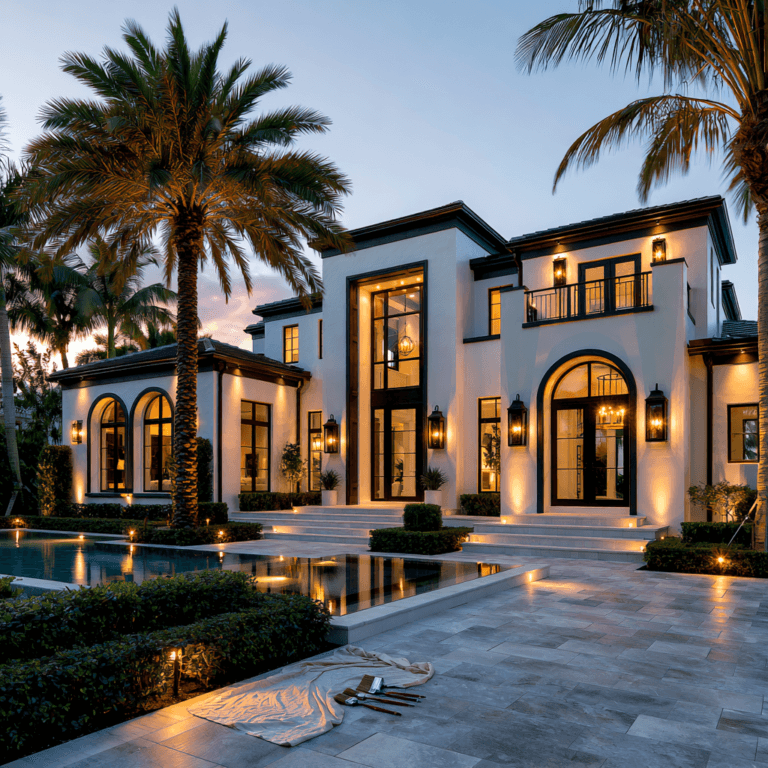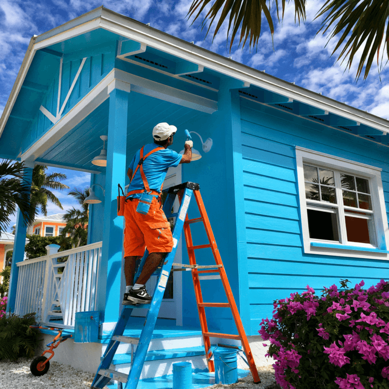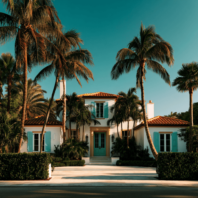

You’ll boost curb appeal with palettes that balance timeless neutrals, bold contrast, and natural texture. Try warm greige siding with charcoal trim, white with black details and cedar accents, or sage green with creamy trim. Blue-gray and bright white feel crisp, while deep green, coastal blue, and matte black add modern personality. Match undertones to your roof and stonework, then layer light, midtone, and dark shades. Ahead, find standout combinations for every architectural style.
Exterior Color Combinations Trending Now
Today’s top exterior color combinations balance timeless appeal with fresh contrast, helping your home stand out without feeling overdone. You’ll see homeowners pairing crisp off-whites with inky trim, muted sage with natural wood, and deep navy with bright architectural accents. These palettes sharpen rooflines, frame windows, and give modern entryways a deliberate, design-forward presence. Choose durable finishes that hold their tone through sun, rain, and changing seasons, so your curb appeal stays polished longer. Consider tonal layering, where light, midtone, and dark shades create depth without visual clutter. Statement shutters and contrasting garage doors also deliver high-impact updates without a full repaint. Keep undertones consistent across siding, masonry, and metal details for a cohesive result. Your color choices should spotlight your home’s best features while signaling a confident, current style.
Warm Greige and Charcoal Exterior Color Combinations
Warm greige siding paired with charcoal trim creates a sophisticated exterior that feels current yet enduring. You get a nuanced neutral foundation that elevates curb appeal without looking stark or predictable. Charcoal defines rooflines, windows, shutters, and entry details, giving your façade crisp architectural rhythm.
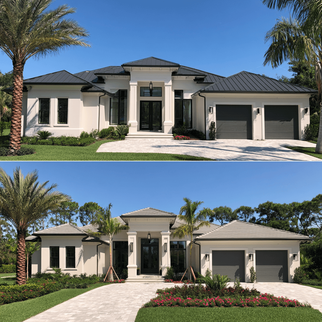
This pairing succeeds because color psychology makes warm greige feel welcoming while charcoal adds confidence and visual depth. To sharpen exterior balance, repeat charcoal on gutters, garage doors, or modern house numbers, then choose a front door in deep blue, muted olive, or rich terracotta. You’ll create contrast that reads polished from the street and layered up close. For an innovation-forward update, select low-sheen finishes that let undertones shift naturally through changing daylight. The result feels tailored, contemporary, and remarkably adaptable across home styles.
White, Black, and Natural Wood Exteriors
White, black, and natural wood create a high-contrast exterior that feels both modern and inviting. You can use white siding as a crisp canvas, then sharpen the architecture with black accents on window frames, gutters, lighting, and the front door. This contrast gives even a simple facade a tailored, design-forward edge from the street.
Balance the graphic palette with natural wood trim around the entry, porch ceiling, or garage door. Warm oak, cedar, or thermally modified wood keeps the look from feeling stark while adding tactile dimension. For an elevated finish, layer in stone accents at the foundation, columns, or walkway. Choose clean-lined materials and repeat black details strategically, so your home feels cohesive rather than busy. The result is a fresh, high-impact exterior that photographs beautifully and stands out in your neighborhood.
Taupe and Deep Green Exterior Color Combinations
Pair taupe siding with deep green trim to give your exterior a polished, nature-forward edge. Ground the palette with natural stone accents, then add a warm wood front door for instant welcome. You’ll get layered contrast that feels current, refined, and curb-appeal ready.
Taupe Siding, Green Trim
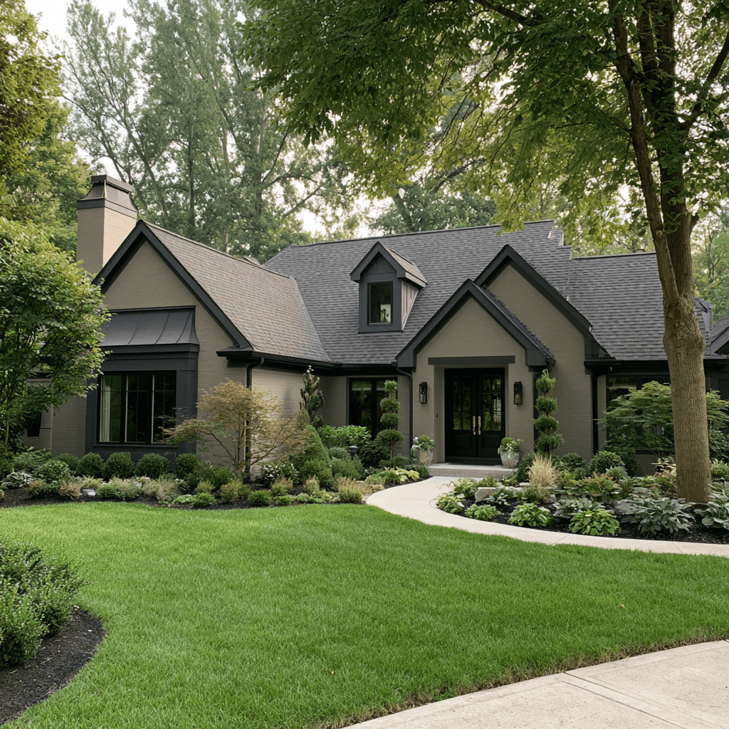
Taupe siding with deep green trim gives your home a grounded, elevated look that feels both timeless and current. You get a refined neutral foundation with enough warmth to soften bold architectural lines, while the saturated trim adds tailored contrast around windows, doors, fascia, and shutters. Choose taupe siding with subtle gray or mushroom undertones for a modern, design-forward finish. Then use green trim in a deep forest, pine, or blackened emerald shade to create crisp definition without the harshness of pure black. This pairing works especially well when you want your exterior to feel connected to the landscape yet distinctly polished from the street. Keep the front door in the same green family or choose a near-black tone for streamlined impact. The result looks intentional, premium, and highly curb-ready.
Natural Stone Accents
Natural stone accents bring texture and dimension to a taupe-and-deep-green exterior without disrupting its tailored palette. Use ledgestone, split-face veneer, or softly variegated fieldstone at the foundation, porch piers, or chimney to anchor the scheme visually. Choose stones with warm gray, sand, charcoal, and muted olive undertones so they bridge taupe siding and saturated green trim instead of competing with either shade. This texture pairing creates a layered, architectural look that feels current without becoming overly rustic. You’ll also gain practical value: stone durability helps high-contact areas resist weather, splashes, and everyday wear. For the sharpest curb appeal, keep the stone application intentional and proportional. A focused base or entry surround gives your façade depth, while allowing the taupe-and-green contrast to remain the design’s polished focal point.
Warm Wood Front Doors
A warm wood front door gives a taupe-and-deep-green exterior an inviting focal point with lasting design appeal. You’ll soften deep green siding’s dramatic edge while adding organic contrast to taupe trim, stonework, or stucco. Choose white oak, walnut, or cedar tones with a low-sheen protective finish to keep the grain visible and the look current. For a more tailored entry, repeat the door’s undertones in exterior accents such as house numbers, planters, porch furniture, or a slim wood slat screen. Matte black hardware adds modern definition without competing with the palette. Consider a pivot-style door, oversized vertical glazing, or smart-lock technology to give this classic material a forward-looking update. Your entry will feel grounded, elevated, and instantly more memorable from the street.
Blue-Gray and Bright White Exterior Palettes
You can give your exterior a fresh coastal edge with blue-gray siding that feels polished, not predictable. Frame it with bright white trim to sharpen windows, rooflines, and entry details for instant curb appeal. For a more modern contrast, pair the palette with matte black lighting or a charcoal front door.
Coastal Blue-Gray Pairings
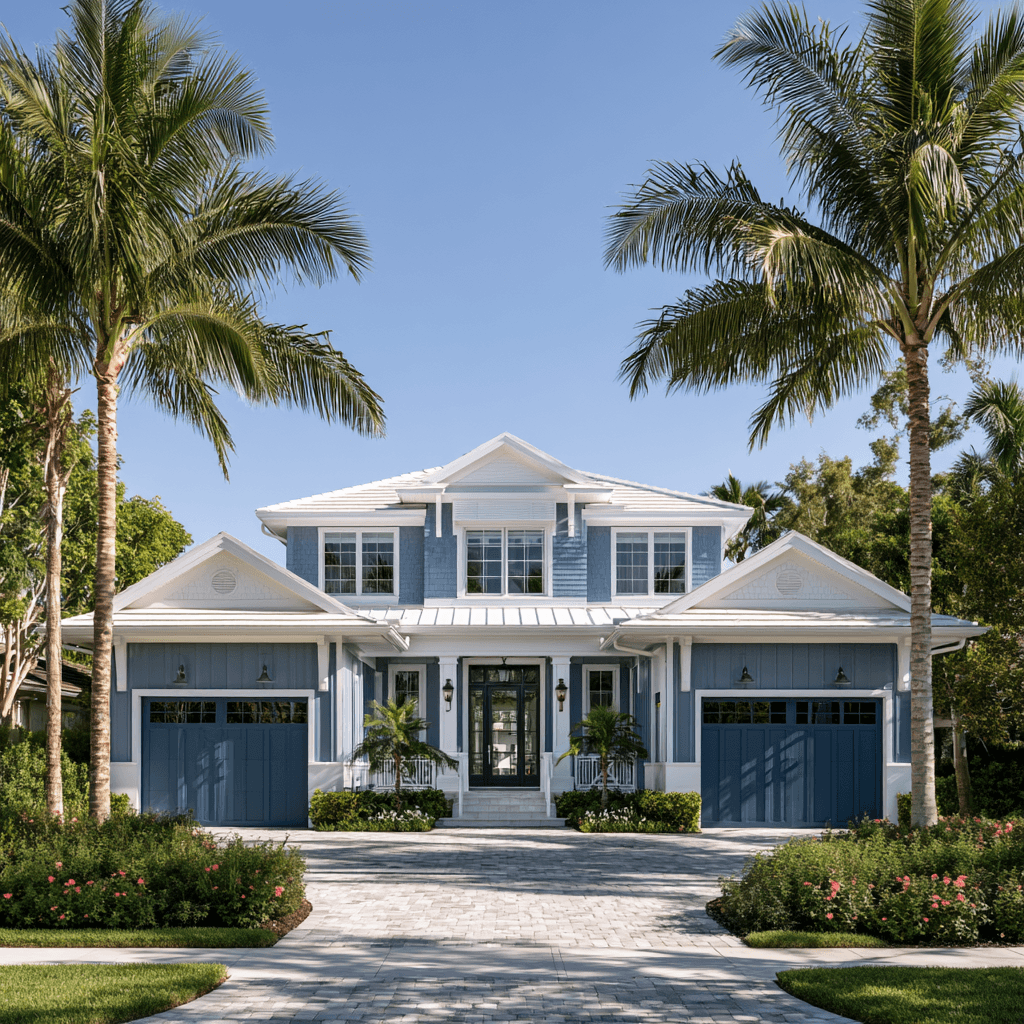
Why do blue-gray and bright white feel instantly coastal without looking themed? You get the effect through undertone balance: a misty, mineral blue-gray grounds the façade, while crisp white keeps the silhouette clean, modern, and highly visible from the street. Choose a blue-gray with green or slate notes for a more architectural, less nautical result. Then layer coastal accents selectively—weathered wood doors, brushed nickel lighting, or pale stone steps—to add dimension without resorting to clichés. Sea inspired textures, such as ribbed siding, limewashed brick, or matte composite panels, give the palette tactile depth and help sunlight shift across the exterior throughout the day. Keep landscaping graphic with silvery grasses and structured evergreens. Your home will read fresh, elevated, and design-forward. It also suits both contemporary and classic rooflines.
Bright White Trim Accents
Bright white trim sharpens a blue-gray exterior, giving windows, fascia, porch columns, and gables a crisp edge that reads polished from the curb. You’ll create a clean, tailored frame that makes soft blue-gray siding look fresher and more intentional in changing daylight.
Choose a neutral, non-creamy bright white to preserve the palette’s cool, contemporary character. Keep trim accents consistent across architectural details so your home feels designed, not pieced together. A satin or low-luster finish offers a refined update while helping edges stay visually crisp.
For stronger curb appeal, let the white define entry surrounds, railings, and window grids, especially on homes with layered rooflines. This streamlined pairing delivers a high-value visual refresh without overwhelming your exterior’s calm, coastal-inspired color story.
Modern Contrast Ideas
Modern contrast comes alive when blue-gray siding meets bright white trim with deliberate, architectural placement. You’ll give your home a crisp, tailored profile that feels current without chasing a fleeting fad. Choose a mid-to-deep blue-gray for broad siding planes, then use clean white on window casings, fascia, porch columns, and roofline details to sharpen the silhouette.
This contrast pairing works especially well on streamlined ranches, contemporary farmhouses, and updated colonials. Add black lighting or a charcoal front door for graphic depth, but keep the white trim dominant enough to preserve brightness. You can also layer material accents, such as warm cedar slats, stone porch bases, or brushed-metal house numbers, to soften the cool palette. The result makes your entry look intentional, elevated, and highly visible from the street.
Sage Green and Cream Exterior Color Combinations
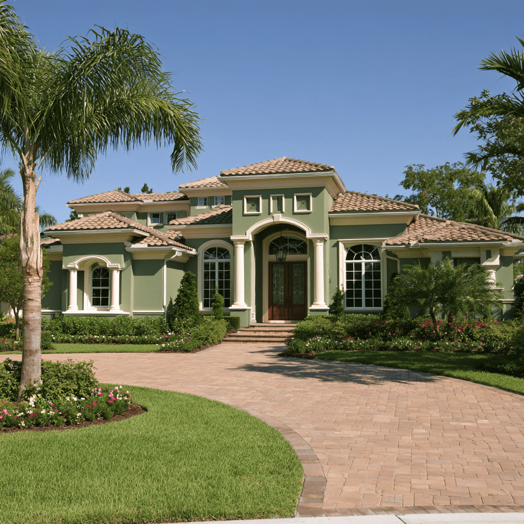
Sage green and cream create a polished, nature-inspired exterior that feels current without chasing trends. You can use sage as the dominant siding color to soften sharp rooflines and make landscaping look intentionally integrated. Cream trim brightens window casings, porch columns, and fascia without the starkness of pure white, giving your façade a refined, high-end read.
For a more design-forward result, try subtopic idea one: pair muted sage lap siding with creamy board-and-batten accents to add texture and visual rhythm. Subtopic idea two: repeat cream on the front door surround and planters for a cohesive entry sequence. Choose warm gray roofing, brushed brass hardware, or aged bronze lighting to keep the palette elevated. This combination helps your home stand out gracefully from the street.
Black Exterior Color Combinations With Warm Wood
Black exteriors paired with warm wood create a striking, high-contrast look that feels tailored rather than severe. You can use this forward-looking pairing to give your facade instant architectural definition and a polished, custom-built presence. Choose a softened charcoal or true matte black exterior for siding, trim, and modern metal details, then introduce warm wood accents at the entry, soffits, garage door, or porch ceiling. Cedar, teak, and thermally modified wood bring rich warm wood tones that keep the palette inviting.
For the strongest curb impact, repeat the wood finish in one or two visible zones rather than scattering it everywhere. Your exterior color scheme will feel intentional, especially when you add clean-lined lighting, dark-framed windows, and restrained landscaping. This combination lets your home look current, confident, and distinctly elevated from the street.
Coastal Blue, White, and Soft Gray Palettes
Coastal blue, crisp white, and soft gray give your home a breezy, refined street presence without leaning overly nautical. You can use coastal blue on siding or a statement front door, then sharpen the look with clean white trim and columns. Soft gray tones on shutters, porch floors, or secondary siding add dimension while keeping the palette modern and calm.
Today’s best white palettes favor slightly warm, low-glare whites that feel polished in changing daylight. For a more design-forward finish, try coastal blue gray pairings with matte black hardware, streamlined house numbers, and brushed-metal lighting. You’ll create contrast that reads fresh from the curb while preserving a relaxed, elevated character. Keep transitions crisp, limit accent colors, and let the layered neutrals make your exterior feel intentionally updated.
Match Exterior Colors to Style, Roof, and Stone
Your home’s architectural style, roof color, and stonework should lead the palette, not compete with it. Start by identifying your roof’s undertone: charcoal supports cool whites, slate blues, and modern greiges, while brown shingles pair beautifully with warm creams, sage, and clay. Create roof harmony by repeating one subtle undertone in your siding or front door.
Let stone textures guide your contrast level. Variegated fieldstone needs quieter paint; smooth limestone can handle richer charcoal or deep green. Consider exterior texture when selecting sheen and trim detailing, since crisp white trim sharpens contemporary lines while muted trim feels more organic. Use color psychology strategically: navy feels grounded, green feels restorative, and black adds tailored drama. Finish with a lighting strategy that reveals materials after dusk, and choose finishes built for material durability.
Frequently Asked Questions
How Often Should Exterior Paint Be Refreshed?
Refresh exterior paint every five to ten years, depending on climate, sun exposure, siding material, and paint quality. You’ll need touch-ups sooner if you notice peeling, fading, cracks, or mildew. Protect your investment with annual cleaning and prompt repairs. Before repainting, use exterior color testing to preview durable, modern shades that suit your architecture. Smart curb appeal ideas, like updating trim or the front door, can extend your home’s fresh, polished look.
Which Paint Finishes Resist Fading Best?
Choose premium 100% acrylic exterior paint in satin or low-luster finishes for fade resistance that feels nearly superhero-level. You’ll get durable color retention, easy cleaning, and a polished curb-facing glow. A velvet finish also performs well on siding, offering a modern, soft-matte look while hiding minor flaws. For trim and doors, use satin or semi-gloss; they’ll keep bold, trend-forward shades crisp longer under intense sun.
Do HOA Rules Limit Exterior Color Choices?
Yes, your HOA can limit exterior color choices through HOA color policies, curb appeal rules, exterior color codes, and neighborhood guidelines. You’ll usually need approval before painting, especially for bold charcoal, deep navy, or high-contrast trim schemes. Review the approved palette, submit samples, and ask whether modern neutrals or updated accent colors qualify. You can still create a fresh, design-forward façade by layering approved shades, finishes, and door colors strategically for maximum impact.
What Is the Best Season for Exterior Painting?
Spring and fall offer the best seasonal suitability for exterior painting, with mild, dry days that help finishes flow smoothly and cure cleanly. You’ll avoid summer’s scorching sun and winter’s wet, chilly setbacks, both of which intensify climate impact on adhesion and color longevity. For a fresh, curb-focused update, schedule when temperatures stay between 50–85°F, humidity remains moderate, and rain isn’t forecast. Your bold, trend-forward palette will look sharper, longer.
How Can I Test Colors Before Painting?
Start by inspecting color palettes against your home’s fixed elements, such as roofing, stone, trim, and landscaping. Then try testing color samples on large poster boards or directly on separate exterior sections. View them in morning sun, afternoon light, shade, and after dark. Use digital visualization apps for innovative curbside previews, but trust real-world swatches most. You’ll spot undertones, contrast, and street-facing impact before you commit to a full paint job.
Conclusion
You don’t need a full renovation to make your home look newly noticed. Ironically, the biggest curb-appeal upgrade may come from something as simple as choosing the right paint pairing. Let warm greige ground charcoal trim, soften black with natural wood, or brighten blue-gray with crisp white. Match your palette to your roof, stone, and architectural style, then let the front door add personality. Your exterior won’t just follow trends—it’ll make the street look twice.